In this step by step guide you will learn how to warp text to
any shape you want. This technique is very effective as it allows you to
experiment further into finding the style of typography that best suits you. This
specific type of typography is more associated with the psychedelic &
hippie era from the 60’s but it can be very well be adapted into your own work
and the style you want it to be.
 |
| STEP 1 |
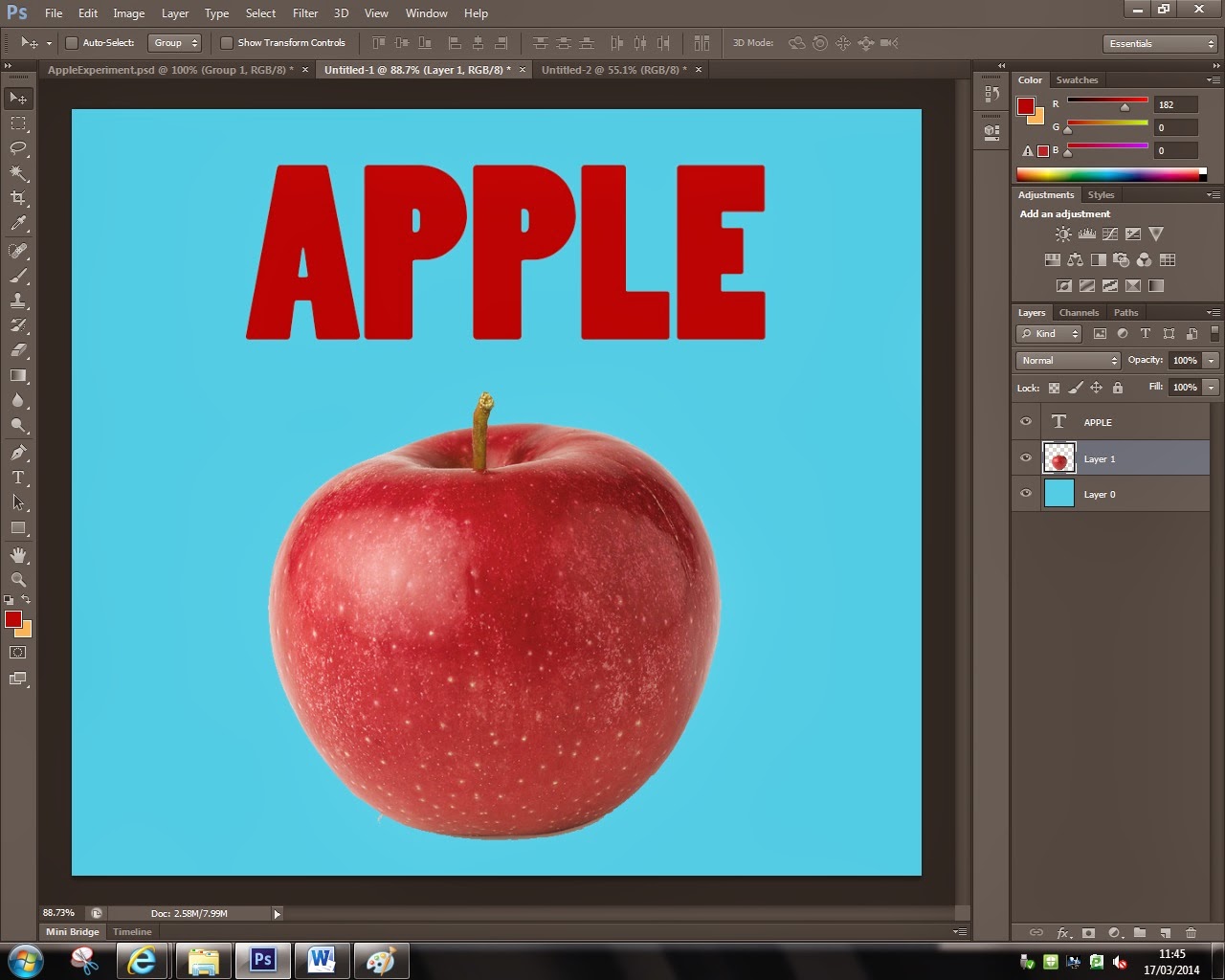
The first thing you'll have to do is find a picture/shape to mould your text into, type the writing ( font, color, size, etc.). I'd personally like it when the text links to the image because it shows the process of thought made to create the image. In this case I chose an apple and text that says apple.
 |
| STEP 2 |
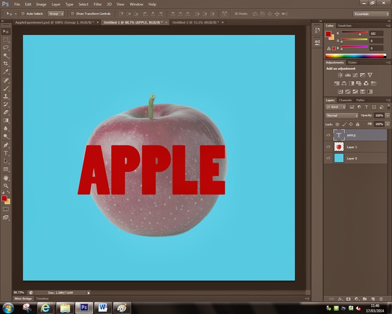
The next thing you will need to do is resize (Ctrl + T) the text so it's decently in proportion to your image. Bare in mind that the text needs to fit to the image so if it's too small it will be too stretched and if it's too big it will just be really hard to read. Decreasing opacity to the image will allow you to see the shape of the image so you can warp the text to it.
 |
| STEP 3 |
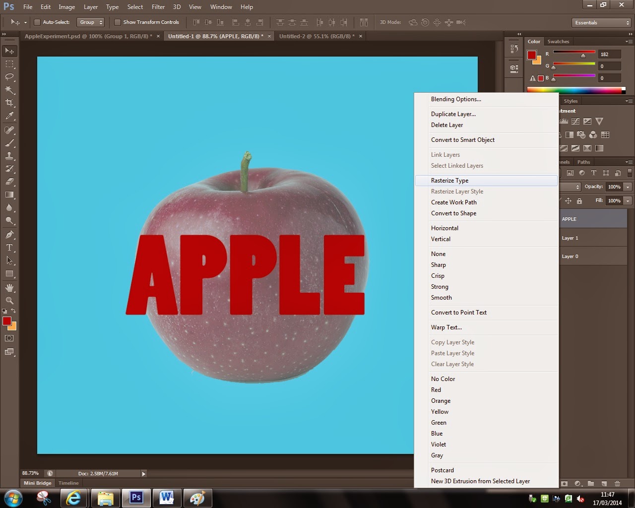
The 3rd thing you'll have to to is rasterize the text. You do this by right clicking the layer and clicking on the ''rasterize layer'' button. This converts the text layer into an image so now you'll be able to warp the image. Rasterizing the text is essential because it will make it much more easier for you to manipulate the ''image'' in any shape you want to.
 |
| STEP 4 |
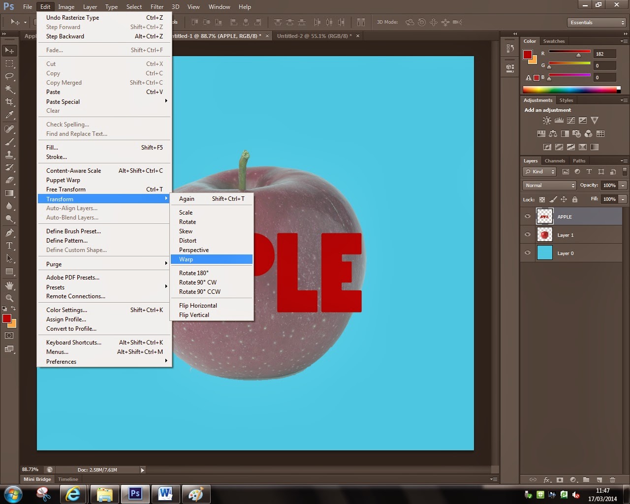
Now that you have rasterized your text you'll be able to warp it. You do this by highlighting the text layer, and going to edit -> transform -> warp. This will open the warping grid over your text and the warping can begin, as you can see in the next step.
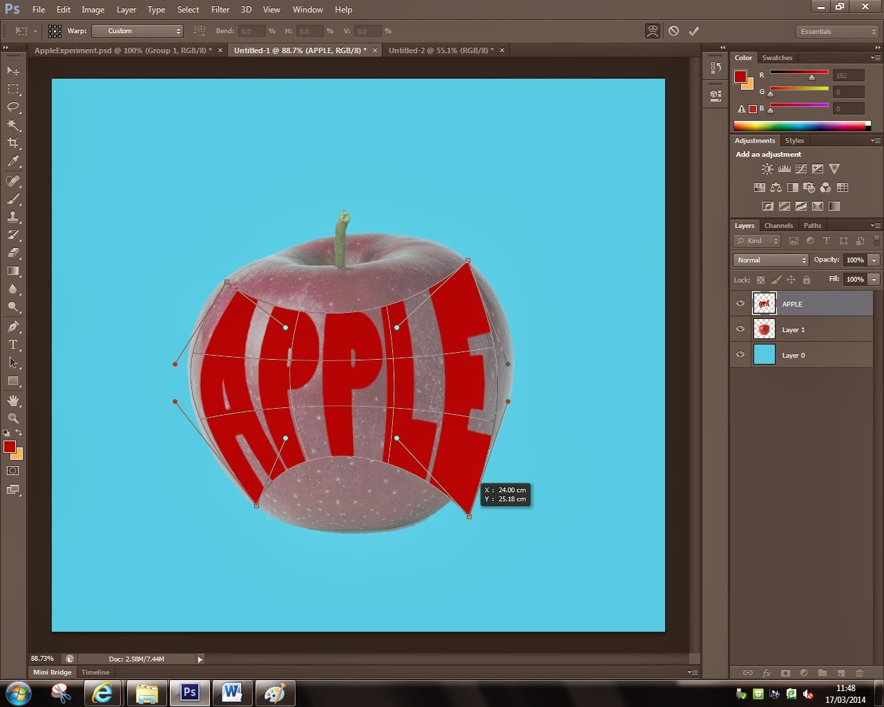
Now that the text warping grid has open you are free to experiment with this grid and see how this technique is of use to you. You can use the corners to re-place the anchor point of the image, use the bars to warp the image around the anchor point or you can simply do it by just clicking and holding inside the grind and by moving your mouse the text will start warping. You will start getting the hang of it after a couple of tries and be able to warp the text in any shape you want to.
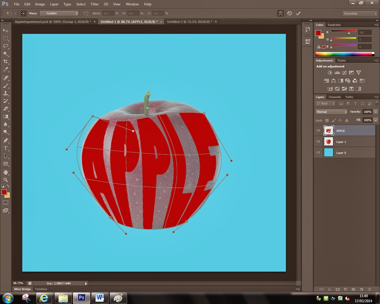
After you've played around and got used a bit to the properties of the warping grid, try to mould the text to the image selected and make sure that it fits inside the shape. You might have to warp it more than once if the shape is much more complicated than just the one of an apple.
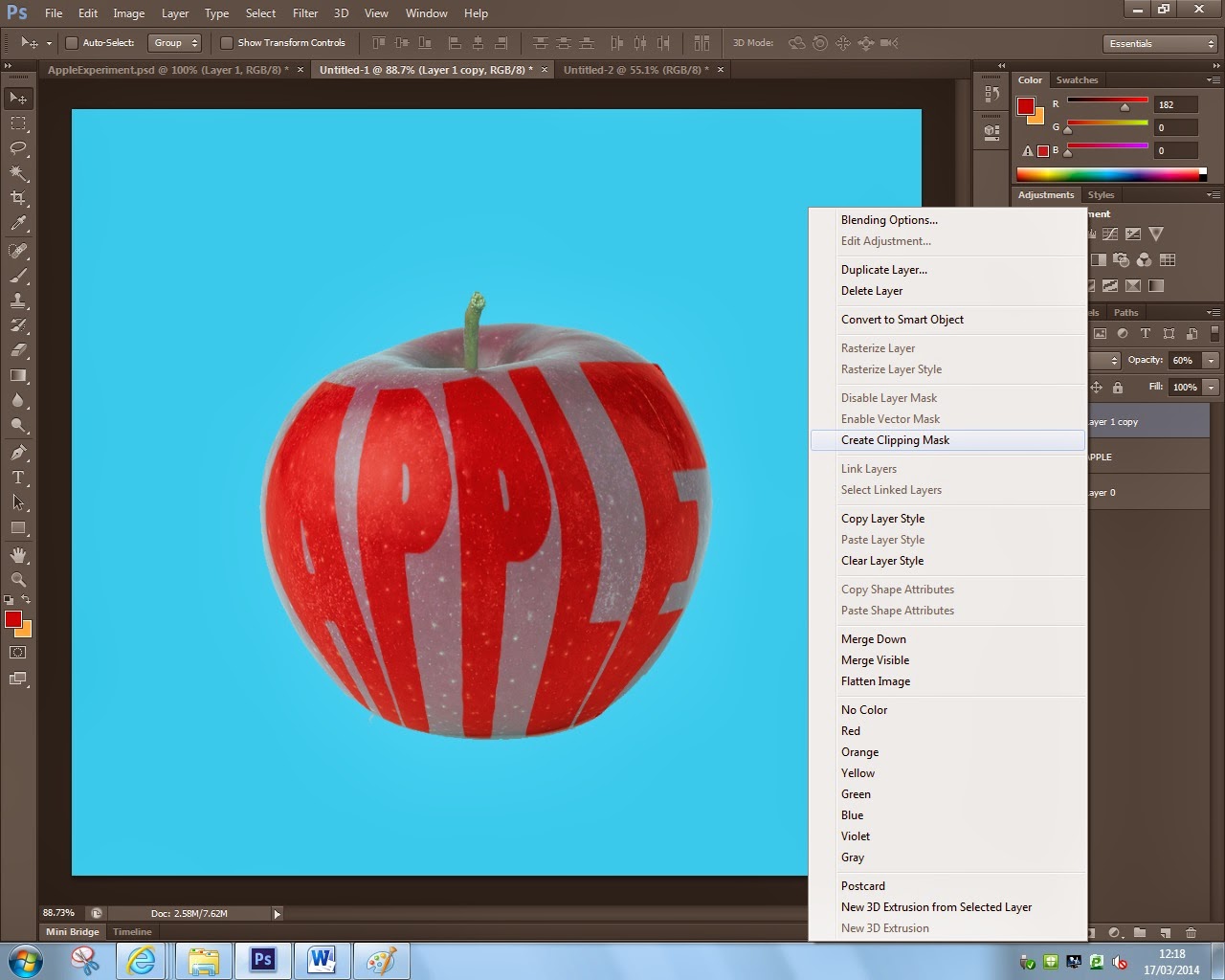
The next part was that I wanted to insert the image into the text. This is another simple process and it's very effective as it gives a much more realistic look to the overall image. You can do this by just simply clicking the layer for the image you have selected, right click on it and select the button saying ''Create Clipping Mask''. Make sure that the new clipping mask is above the text in the layer section. Now you'll be able to move the image around inside the text, re-size it, give it a different color and anything else that would interest you.
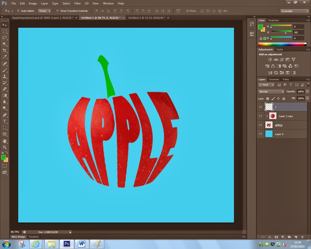
Now your image will look like this with the exception of the green stem. I made that exactly the same way i made the text. I used the letter ''I'' , rasterized it, changed it's color, and warped it into the shape of a stem of an apple. This technique could be used in so many ways it's unbelievable, experimentation and imagination will give ou some interesting results in the field of digital media.
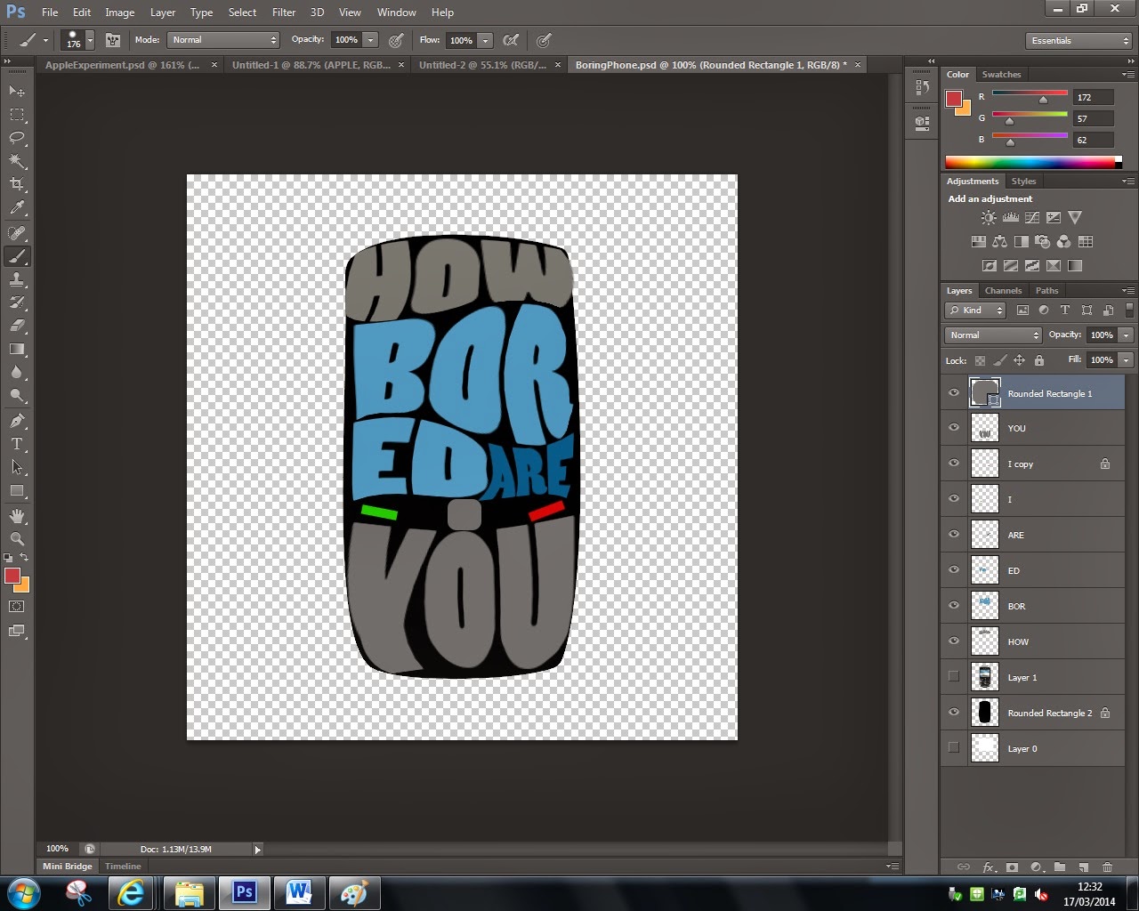
Here is another experiment of mine where i tried to use the shape of a Blackberry Mobile Phone and type text inside of it. The text relates to the idea of how teenagers have to always check tehir phones even if there's nothing new or incredibly intriguing fo them to find out about. I'm not that satisfied with this design because i's hard to tell that the shape is a phone and also the color scheme is too boring, but it's an experiment and it's a step in the process of creating something good.
As i mentioned in the beggining, this style is specific to the hippie 60's so i tried to create some kind of poster in a psychedelic style to see how it would look like. I am pleased with the asthetics of this design but the only thing ''out of place'' is that the text is just in the middle of the canvas with no borders or not on something(billboard or welcome sign). I did this from pure curiosity as this does not comply with the brief because it states that we're to create images from text.


