EVALUATION
My intentions for
this project were to show how digital media can enrich the possibilities of
experimentation and also how sometimes digital media can be more favourable over
traditional techniques. Like the brief required, I was to create a final piece,
an image constructed purely out of words and with the help of my experiments
and research, show how digital typography/media really helps when experimenting
and how it gives you much more flexibility than traditional media and techniques
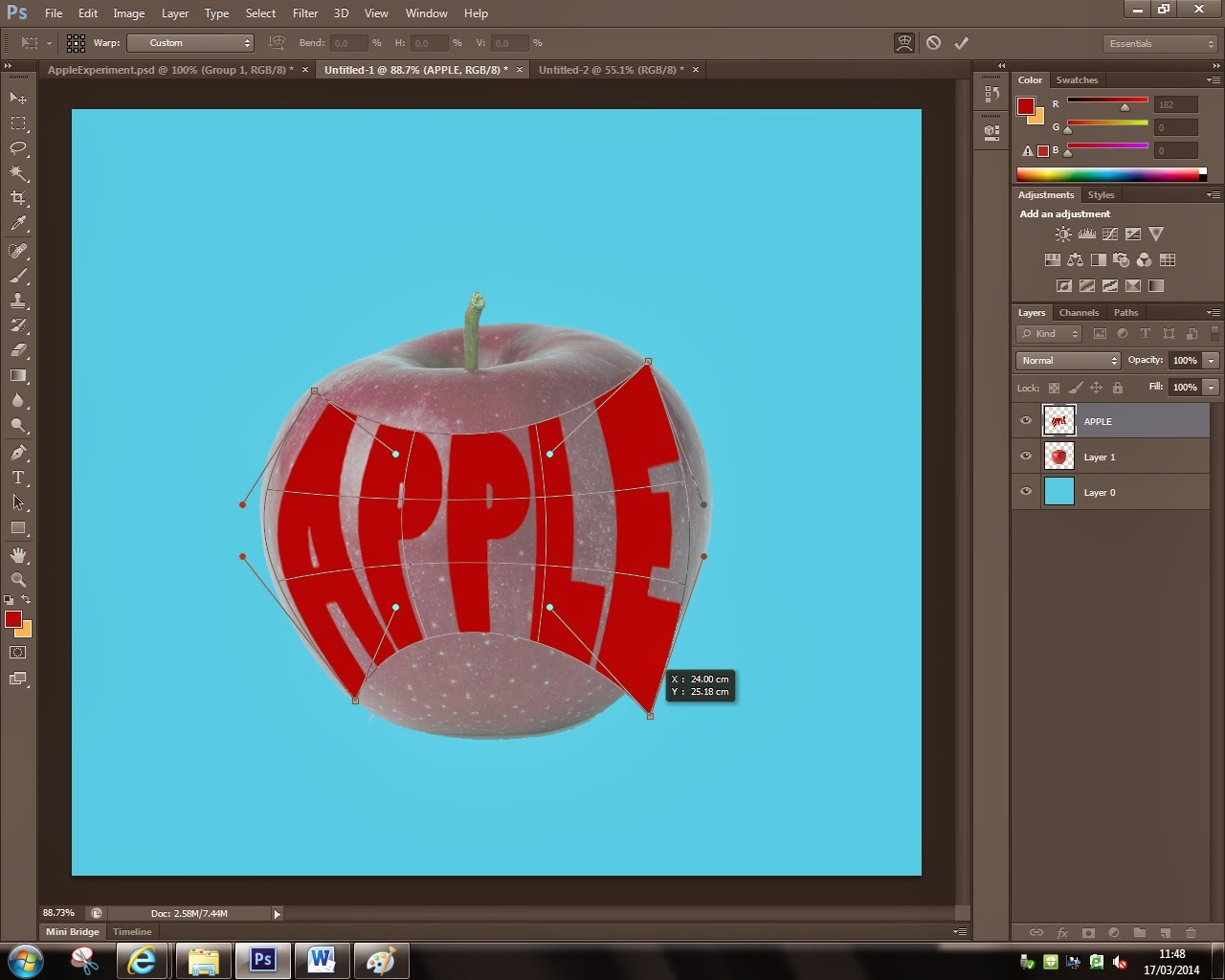
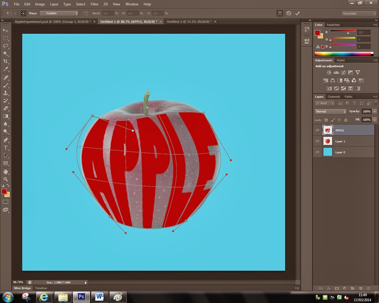
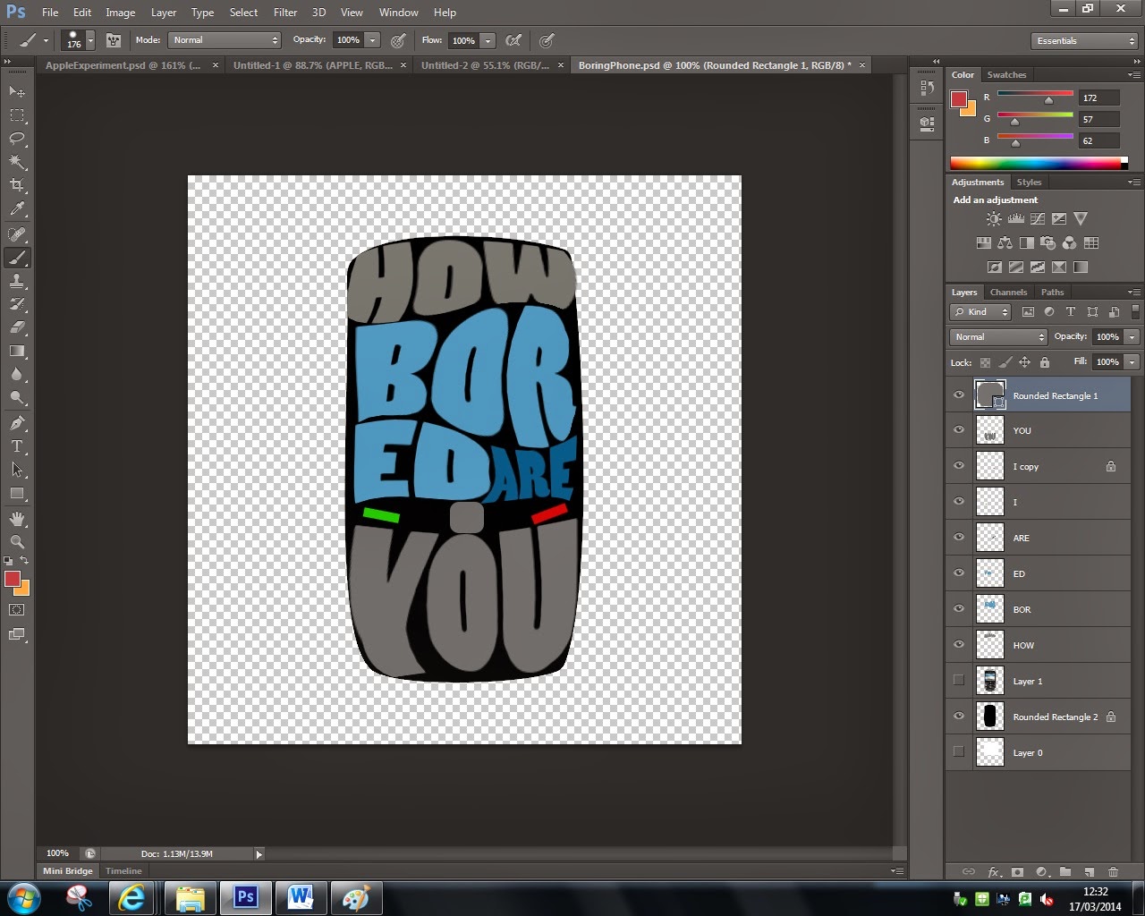
would. My plan for my final print was to create an image out of typography
which also has strong contextual information behind it that also has a
presentable and interesting aspect to the eye of the viewer and I believe I successfully
did that as my final piece has good aesthetics and the contextual information
is really clear as the words and the shape they create link together perfectly.
One of the three
artists I researched is Mary Kate McDevitt, and most of her work is based on
traditional media and techniques, but the thing that influenced me from her
work is the aspect of it and the messy spontaneous aesthetics in the colors she
uses. Another one of the artist that I investigated on is Craig Ward, and his
work is more digital based involving different Photo shopped fonts and effects.
From this research I attempted to combine both of their styles where my work
will be made through the use of digital media and add Mary’s traditional look
to some elements in the image. The 3rd artist I researched is Jamie
Reid, and what I picked up from this research is the ability to show contextual
information in my work as this aspect stands out mostly to me from his artwork.
Throughout this
project, from beginning to the end, I perfected my skills in Photoshop and use
of digital media and I also learned new techniques and ways to manipulate my
work, which really helped me make my final piece as effective and impressive as
I could. The knowledge that allowed me to complete this project was provided to
me by my teacher and also a big part of it from my research which really
influenced my work.
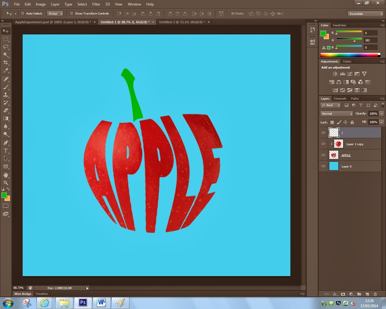
One thing about my
final piece that I feel I succeeded in is the contextual information behind the
design and how the text and the image it creates really go hand in hand to make
the viewer think more about this piece and about the artists intentions. If I were
to go back and work some more on this project, I would have wanted to make 2 or
3 more final pieces in this style so I had a greater range to choose from as my
final piece, and that would have shown the process of thought and how I experimented
with digital media all the way until the end of the project.
Overall I am happy
with the final outcome of my typography project, and I believe that my final
piece is effective and has a great impact on the viewer as the contextual
information and the techniques and tools used go really well hand in hand to
create the final piece presented in this blog.